Clinique Global Marketing Strategy
Global Navigation Redesign
Project Partners: Senior Product Designer(myself), UX research, and Design Director
Services: Product Design, Research, Responsive Design, Prototype
Duration: 3+ months
Overview
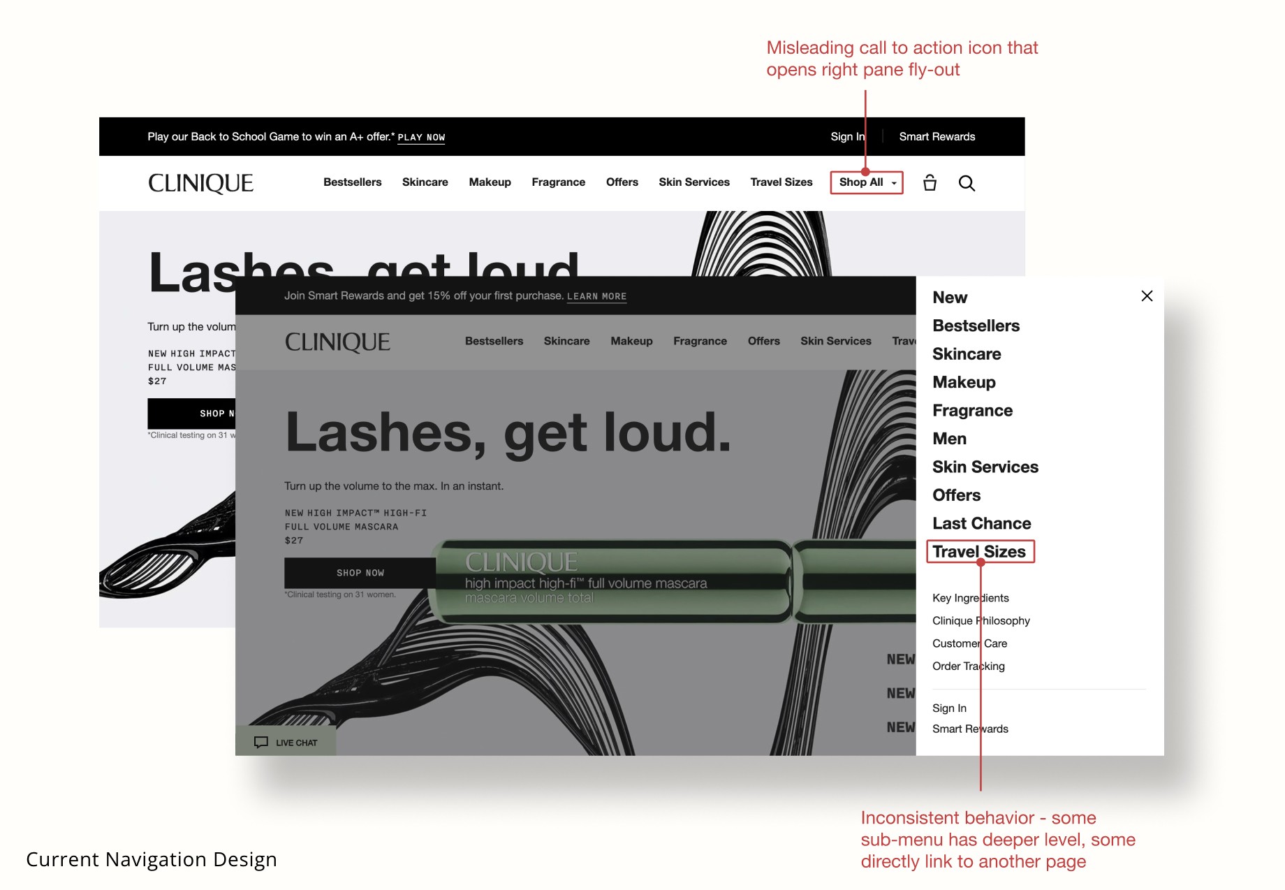
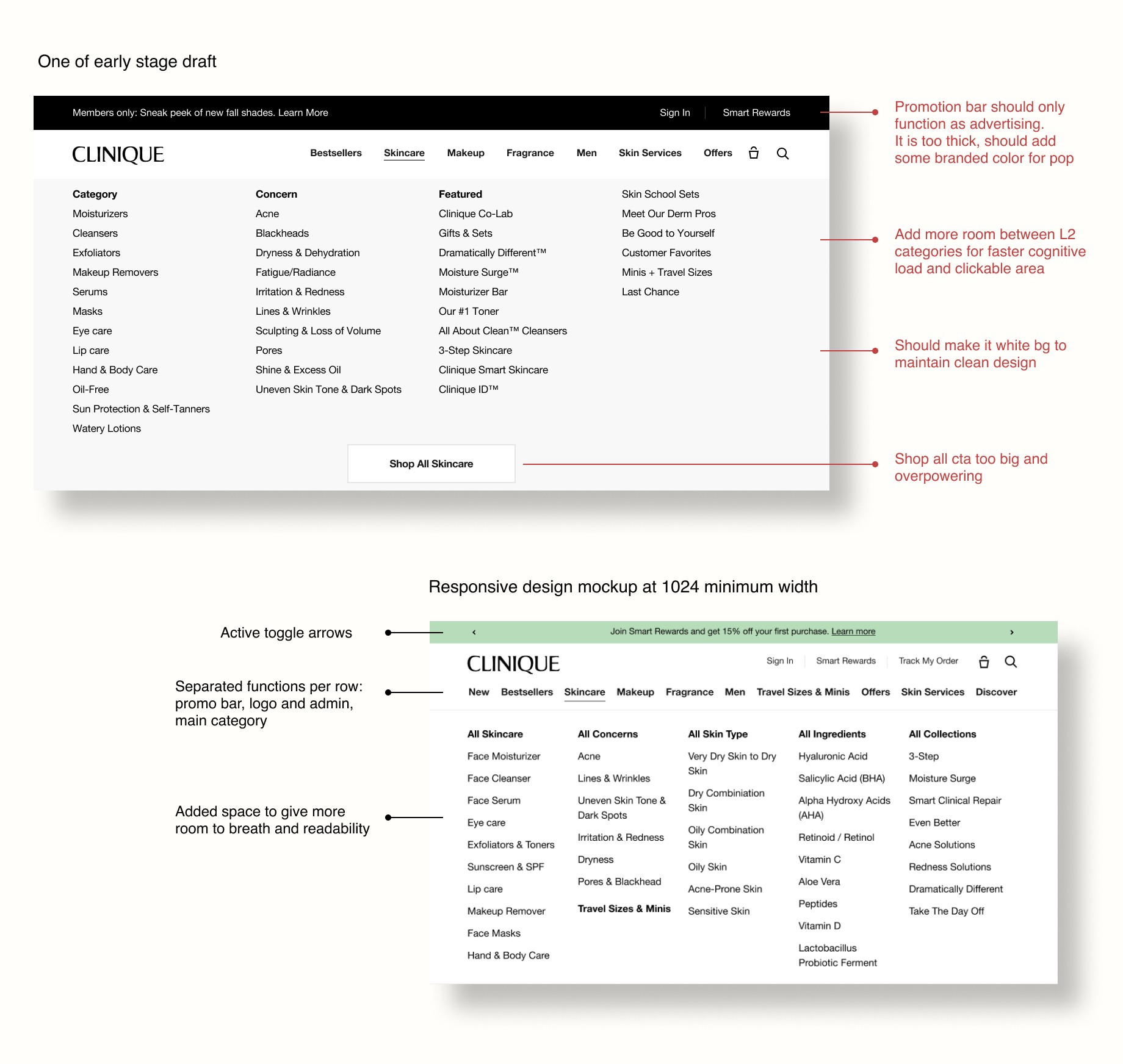
Going beyond intuitive and familiar hover dropdowns
The right hand fly-out function of the Shop All feature within Clinique’s navigation system is the most underutilized button and causes the customer friction when attempting to navigate Clinique’s website. It also needed updates on taxonomy, reorganization of popular menu to better serve customers needs.
Baymard Institute Recommendation
Replace Fly-Out Navigation with Dropdown Hover Menus
Usability Test: Qualitative Data
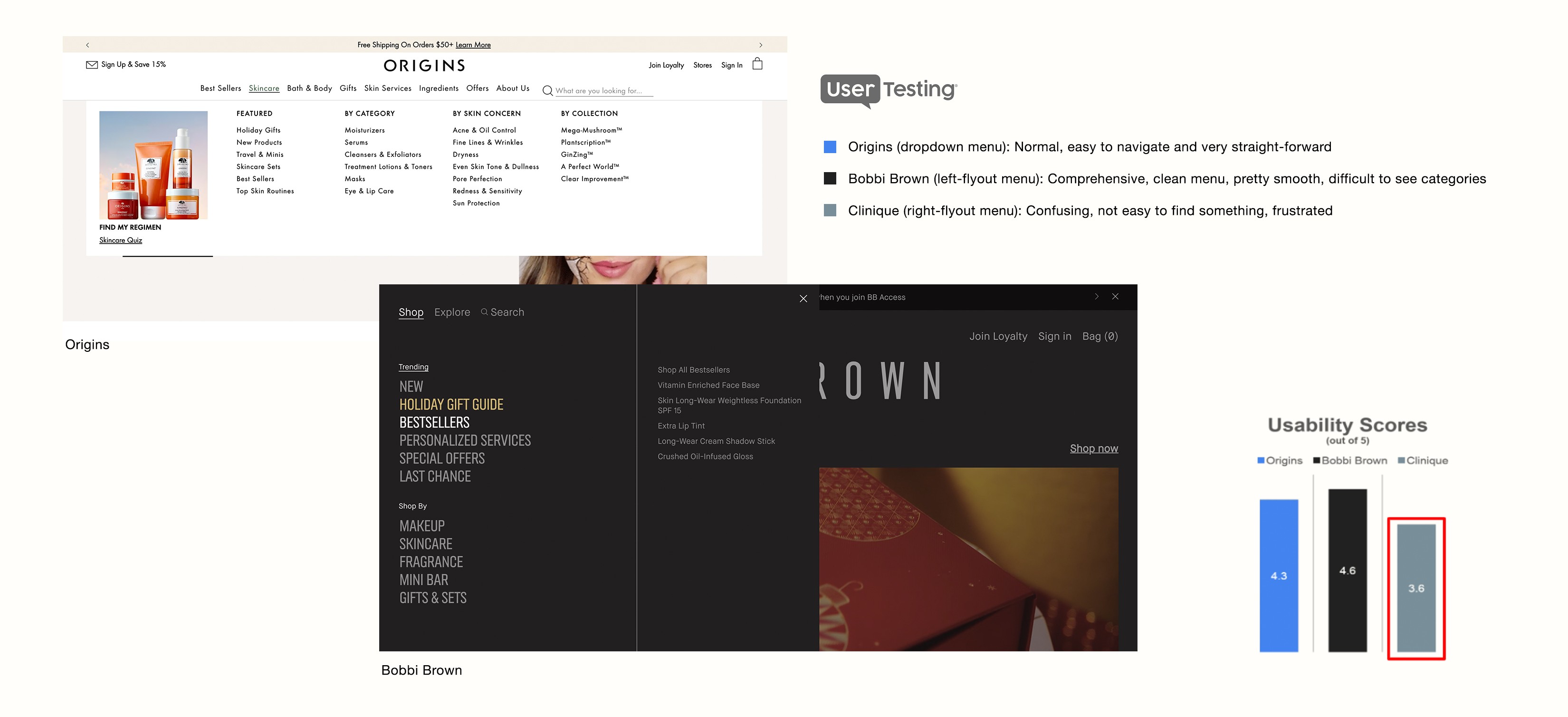
User Testing Favors Origins' Dropdown Over Clinique's Fly-Out Menu
Our UX research team tested top-level navigation designs with five participants, comparing Origins' dropdown menu, Bobbi Brown's left-side fly-out menu, and Clinique's navigation. Four participants found Origins' navigation "very easy" to use, while Clinique's right-pane fly-out menu was criticized for limited visibility and disorienting interactions.
Contentsquare: Quantitative Data
$2M Annual Lift Predicted with Navigation Optimization
Clinique partnered with Contentsquare for a navigation analysis, revealing key insights: a low 2% click rate on "Shop All," high conversion rates for "Men" and "Offers" (around 30%), and opportunities to improve category visibility. The analysis predicts a potential $2M annual lift in the US with an optimized design.
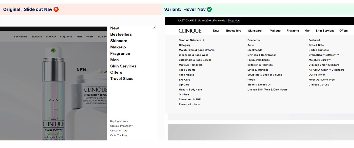
A/B testing & Conclusion
Hover Dropdown Nav Increases Clicks, Reduces Search
While ongoing research and UX efforts were in progress, we tested our hypothetical idea with an A/B test on a horizontal dropdown nav variant, which showed a +420.89% increase in sub-nav clicks and a -12.70% decrease in searches, suggesting users find products more easily and navigate faster.
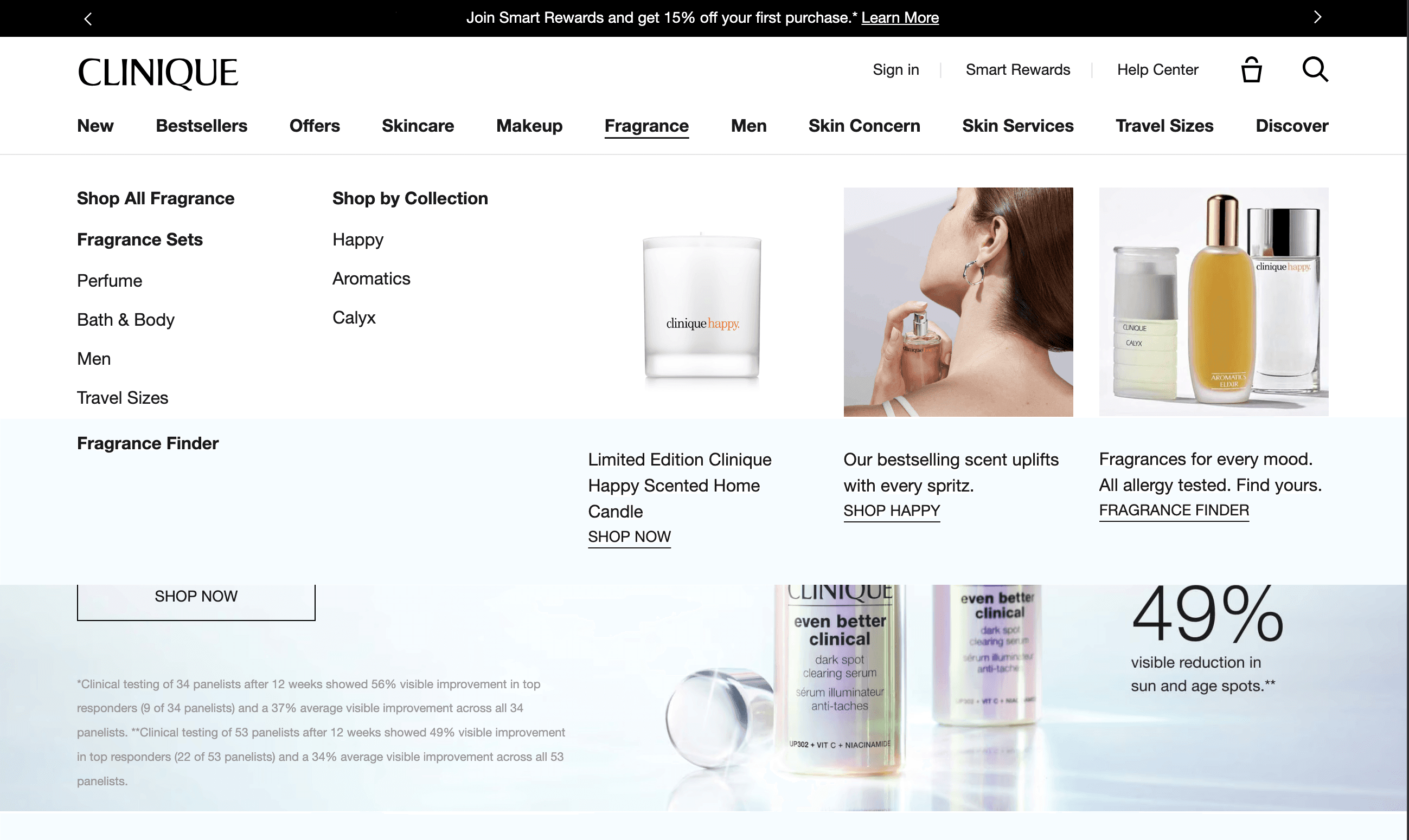
Design & Development
After studying over 10 competitors' menu designs, I began sketching wireframes. The update aimed not only to improve orientation but also enhance usability. With the existing overload of text and categories, incorporating images offers users a visual break, reducing cognitive strain.
ADA Compliance
Ensuring Accessible Navigation Design
To meet ADA standards, I ensured sufficient clickable areas across devices—24px for desktop and 44px for mobile. I also focused on color contrast for readability, keyboard navigation, and clear focus indicators to support users with assistive technologies.
Hands off & Soft Launch
Making Sure Everything
Runs Smooth
I used the Tailwind framework for breakpoints per dev team's recommendation and a Figma plugin for a realistic experience. Once approved by stakeholders, including brand strategy, PMs, and the Global UX/UI team, I checked in with engineers to align expectations on design, functionality, interaction (micro-animation) and responsiveness.
Once the test site was ready, I conducted QA and created annotated Figma files for side-by-side comparisons to refine the live product. After launching in North America in November 2023, the product will roll out to APAC and EMEA. This process allowed me to apply both design and collaboration skills, ensuring a seamless transition from development to launch.
More work
(6)